Credit to “Bees colony populations statistic data” collected by a non-profit sporadic bees hive owners throughout United States over the years. I built on this corner-stone datasets into this Dash Plotly application. To expand on this bees colony populations datasets, I scoured the US Department of Agriculture databases and Kaggle.com for farm pesticide application by States throughout the years. Piecing three different datasets have been a balancing act since different datasets were recorded by different timeline, from month, quarter to annual and regions. To show all these related data in a meaningful way on tight possibly mobile screen, also was another challenge which I luckily was able to overcome with Dash Plotly library.
Finally an application showing the history of US bees colony populations fluctuated by States and years with respect to agriculture farm pesticides spraying by States and years, was built.
“Checkout the live Bees Colony Collapse and Pesticides Usage in US application here”
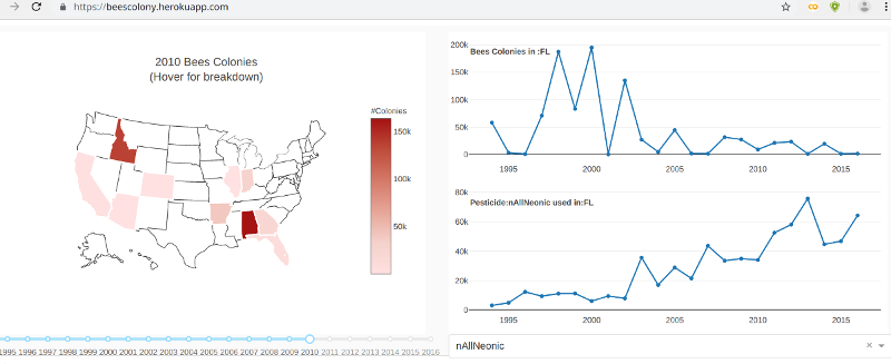
Working with Google colab workbook, python and pandas library, the datasets were downloaded, cleaned, joined into actionable dataframe which then fed into Dash Plotly library. I chose Dash Plotly library to build this Bees Colony application because Dash Plotly enabled a high responsive and interactive performance. Equally important was Dash Plotly enabled me to integrate three different plots onto one screen and with high interactivities between all the plots. Changing a States, year timeline or pesticides used during the years or states, will automatically update all related Bees colony graph and vice versa.